Friday, 14 December 2012

Anthropologie Spring Winter


Here I chose Anthropologie to base a my Spring window idea on. I've created 'roots' that would be crafted out of wire, paper mache and paint. I have chosen this as it could bring a lot of depth, colour and motion to the window.

Urban Outfitters Autumn/Winter Window

Here I have come up with an instillation idea for Urban Outfitters. 
The outfit dress on the mannequin is a smart/casual outfit to be worn on a Christmas evening ‘do’. 
The idea of the concept is to reflect Urban Outfitters’ reoccurring references to aztec/ ethnic prints. It also in keeping with the Christmas theme - by using iconography of the idea of ‘angels’. The structure of the feathers falling also gives the motion of snow, which again, is in keeping with traditional Christmas visuals. 

Whistles Winter Window display idea


The next window display concept I came up with was for Whistles. I decided to focus on the Christmas season, thinking of how it can be put in place before Christmas and throughout the season. The main concept here was 'theatrical' - and the idea of people dressing up for a special occasion.

Window display Fred Perry Autumn


Here I decided to produce a window celebrating the withstanding classic and iconic items that Fred Perry have sold since the very beginning.  The idea behind this is to create an archive visual. The logo is fully created between both hanging props.

Window design Topshop


 I set myself a task to come up with creative ideas for window display designs. 
I broke it up into 4 categories Spring, Summer, Autumn and Winter. 
Here is the 'Summer' window idea, I chose to focus on the theme of 'festivals'

Saturday, 7 April 2012

Wooden broaches


 After alot of sanding, screen printing and hard work I have completed a batch of broaches!

Urban Outfitters


Guildford Urban Outfitters have kindly put a couple of my prints up in their store!

Saturday, 15 October 2011

Devon LMC


Here is a front cover design I was recently commissioned to do for an annual report.

Artarama


Last week I was very lucky to take part in a charity auction organised by Karmarama. My print (the one on the far left) ended up going for £300!
- I still have a couple available to buy on request.

Sunday, 14 August 2011

H20


 Here are some illustrations I designed for the Bath Spa student magazine H20. Both are made using paper sculptures.

Monday, 25 July 2011

Photo Etching

I decided to try a new printing technique to create a lecture poster. 

Friday, 22 July 2011

Urban Outfitters

I had a pleasant surprise to see my work was picked to go on the Urban Outfitters Class of 2011 project.

http://www.urbanoutfitters.co.uk/projects/class-of-2011/page/class-of-2011/

I'm planning on doing some more wood prints soon, just need to collect and sand the pieces first!

Thursday, 21 July 2011

D&AD

A couple of weeks ago I was lucky enough to have two of my pieces of work in this years D&AD show.
Amber and myself also got to man the stand on Sunday which was a good to take part in.

Here's a couple of pictures (bad pictures!) of my screen printed Black Swan Poster and also a poster                                 based on the 1920's musician DeFord Bailey printed on newsprint at D&AD.


Both posters are available to purchase


Monday, 4 July 2011

Building and Shaping the Future


This was a project produced to show my professional practice throughout the year. I divided it up into four sections: projects set by the course, notes on visiting professionals, professional practices within University and professional practices outside of University. To represent how all these elements help shape my future the sections were split up into different coloured shapes that then slot together. The separate shapes then have codes that match up with a picture index.


Screen printed boxes using TW ink

Sunday, 5 June 2011

YCN Competition - Green & Black's


Here the competition brief was to "develop a marketing campaign that gives new consumers a motivating reason to trade up to Green & Black’s above the other premium chocolate brands out there." I decided that the  solid clear reason why customers would want to buy into this brand over others is the fact that organic chocolate is better for you. After coining a slogan I decided it should be echoed in the packaging itself.

Here is a bit of advertising I designed to go along with the branding of the product:

Matilda Saxow Lecture Poster


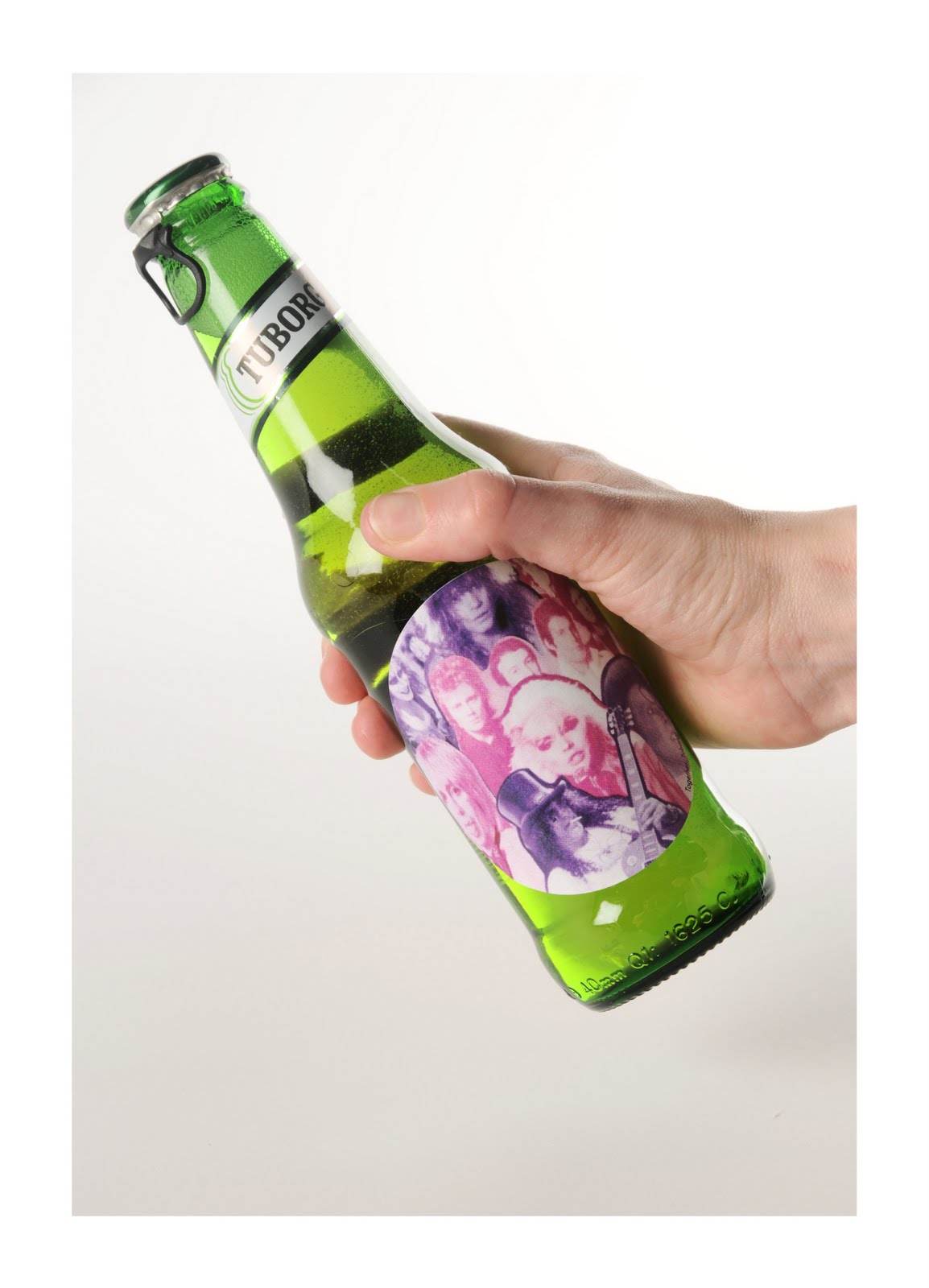
YCN Competition - Tuborg


The brief was to "use the theme of “Live Unleashed”, we want you to come up with ideas 
that break the mould and will grab people’s attention." – From this I decided to produce 
limited edition collectable stickers using different genres of music. They would be re-usable 
stickers that you could peel off and keep.

Here is some advertising I produced to go along side the branding:

Thursday, 14 April 2011

Thursday, 7 April 2011

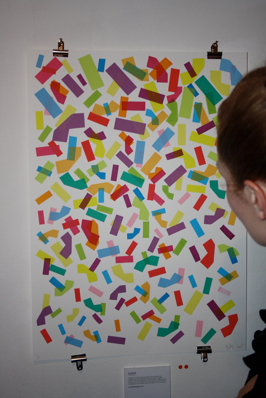
Black Swan exhibition poster - 17 layer screen print
Photograph by Kate Wardale